Epworth Children and Family Services, a long-standing organization dedicated to supporting children and families in crisis, recognized the need for a digital-first approach to branding. As they looked to the future, they aimed to modernize their brand identity to better communicate their purpose, connect with their audience, and reflect their broad range of services. This transformation was driven by a desire to create a cohesive and accessible brand that aligned with their mission while embracing the power of digital communication.
My contributions included Creative Direction, Photo and Video Direction, and Content Creation.
Objectives
• Clarify Epworth’s purpose and highlight its life-changing impact
• Address communication challenges resulting from a wide range of services
• Ensure the brand reflects the organization’s evolution and mission
Strategy
• Focus on empowerment as a central theme of the rebrand
• Leverage digital transformation to enhance communication and engagement
• Adapt branding to the growing importance of digital storytelling, especially during the pandemic

Design Approach
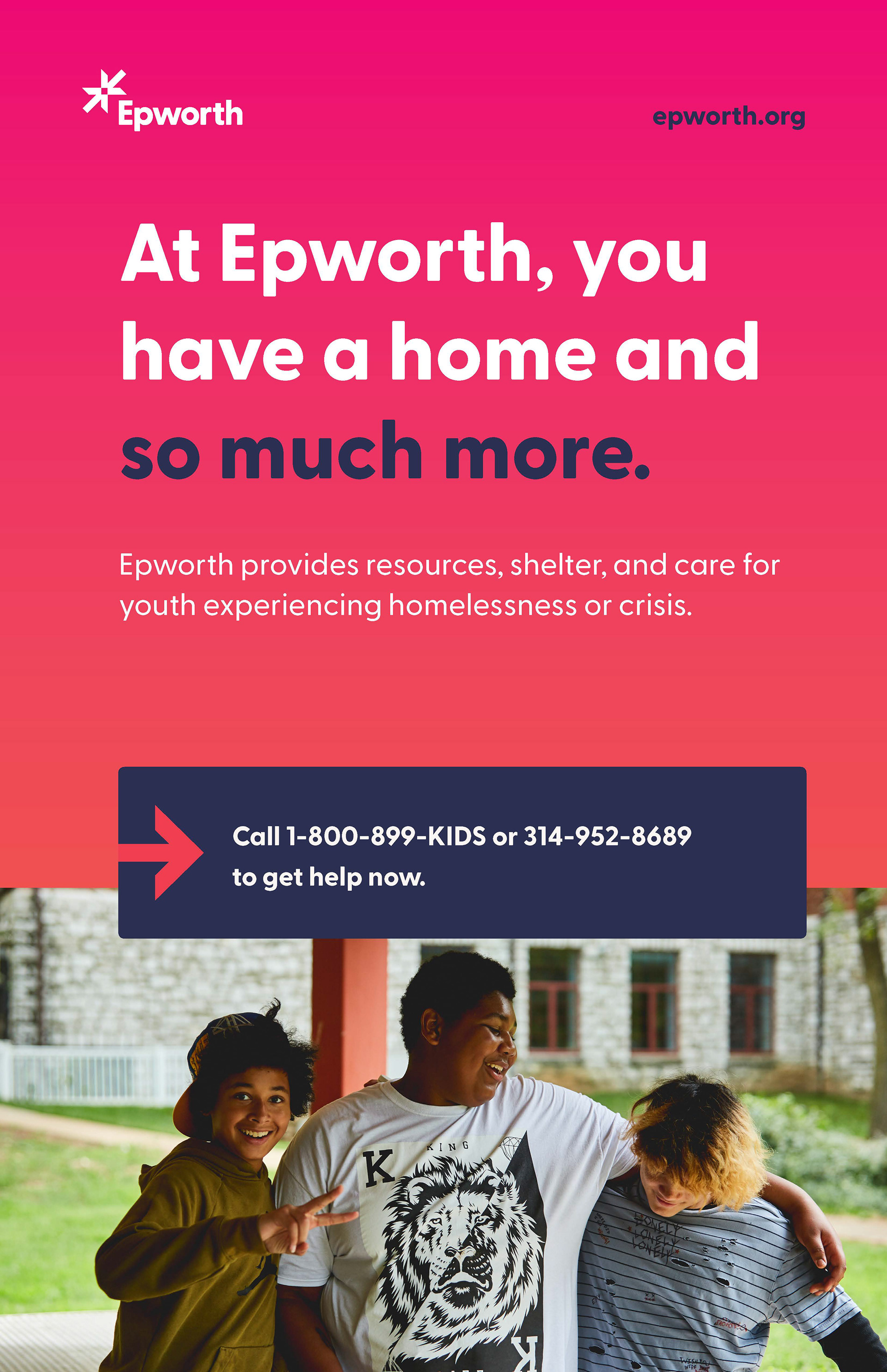
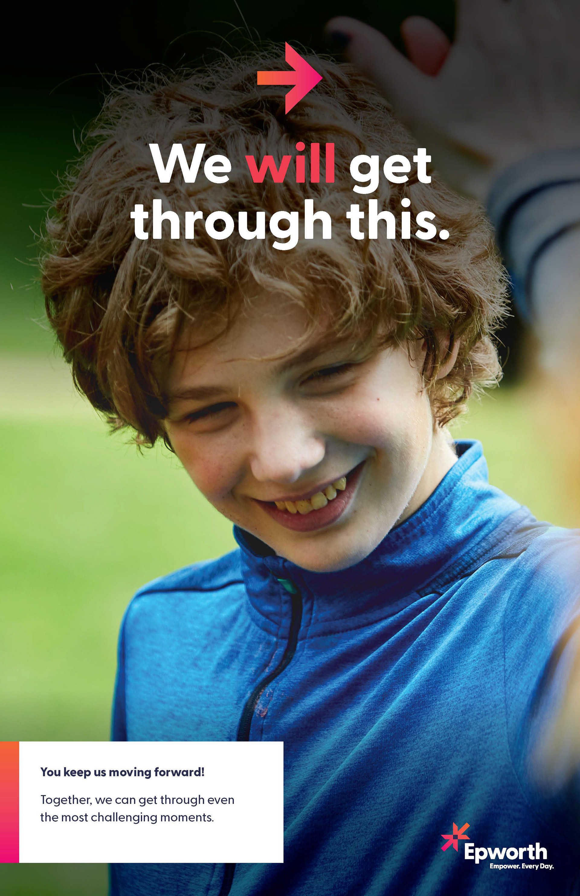
• The new logo, featuring two arrows, symbolizes relationships and empowerment
• A bright, youthful color palette, balanced with navy, reflects both energy and stability
• Branding elements were optimized for digital platforms to ensure accessibility and impact

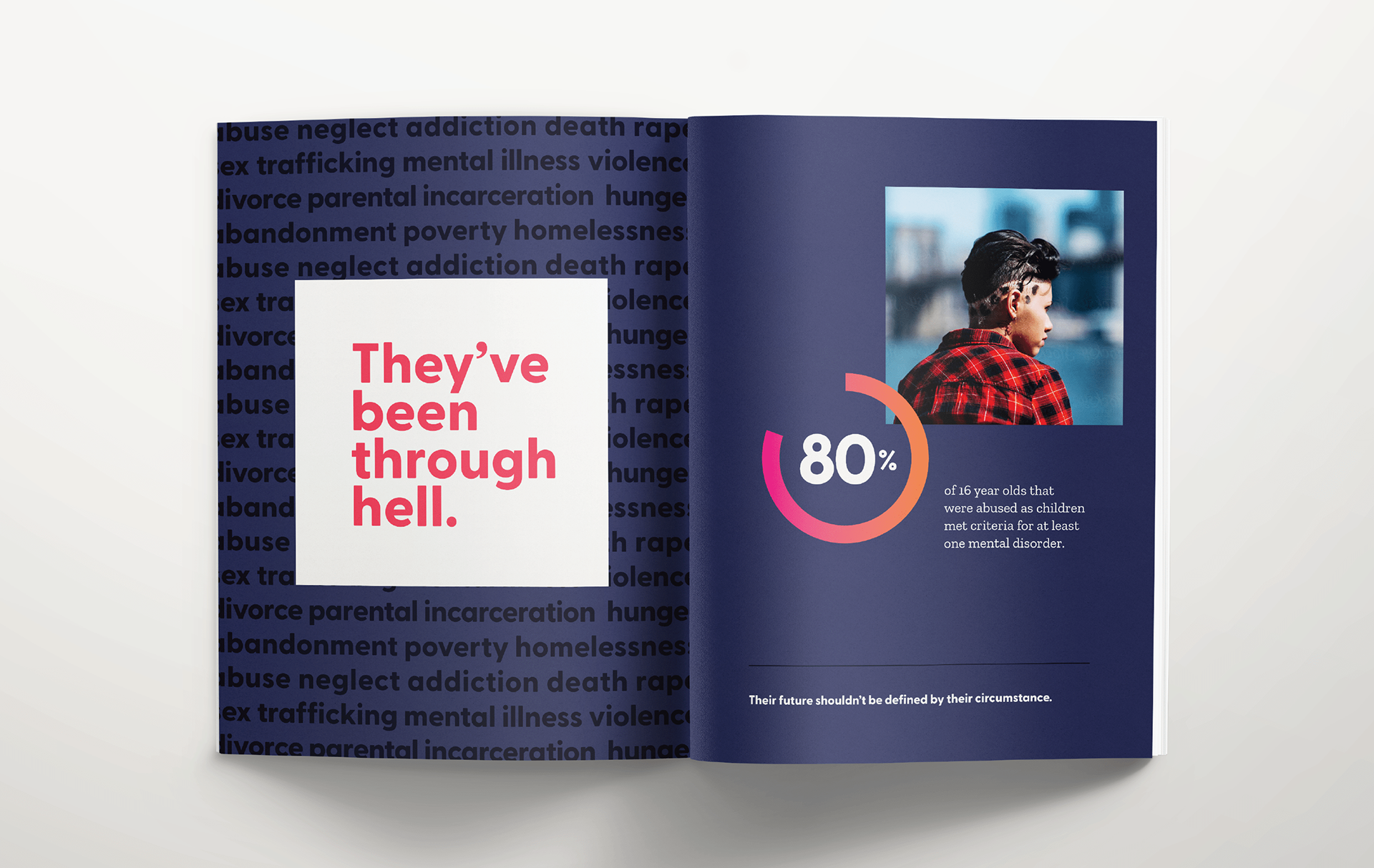
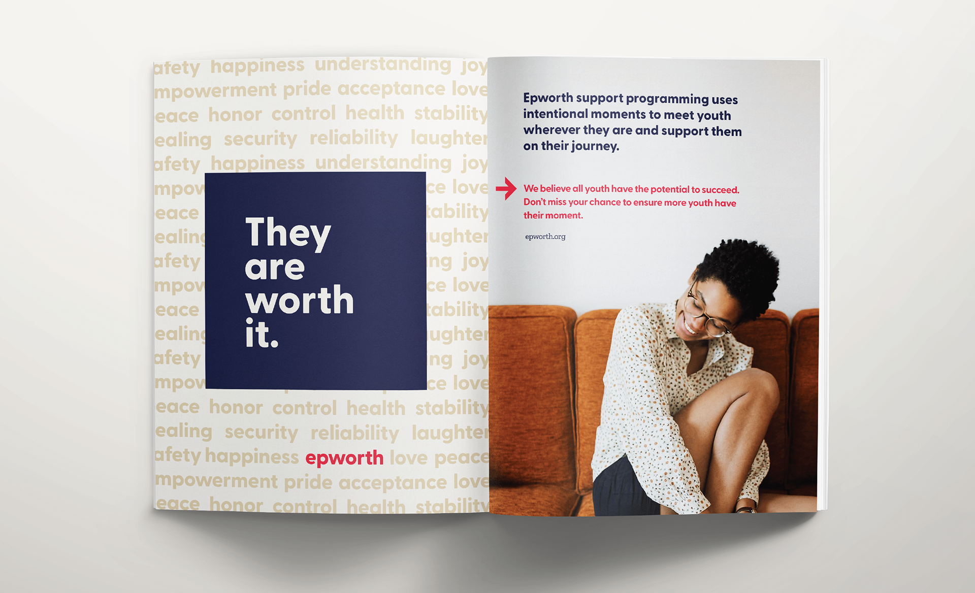
By modernizing its branding, Epworth strengthened its ability to connect with donors, families, and the broader community. This refreshed identity not only enhances the organization's digital presence but also reinforces its mission to empower lives every day.


